About the Client
BoxCast is a live-streaming platform that builds hardware and software solutions for organizations and events.
Setting the Stage
About the Project
Across BoxCast’s digital experiences (including their product dashboard, iOS app, marketing website, and backend for support staff) interface components were being consistently created and inconsistently used.
What Was the Goal
How might we reduce the time it takes to design and develop new interfaces?
Team Structure
Product Designer, Brandon Geib
Front-end Developer
User Experience Manager

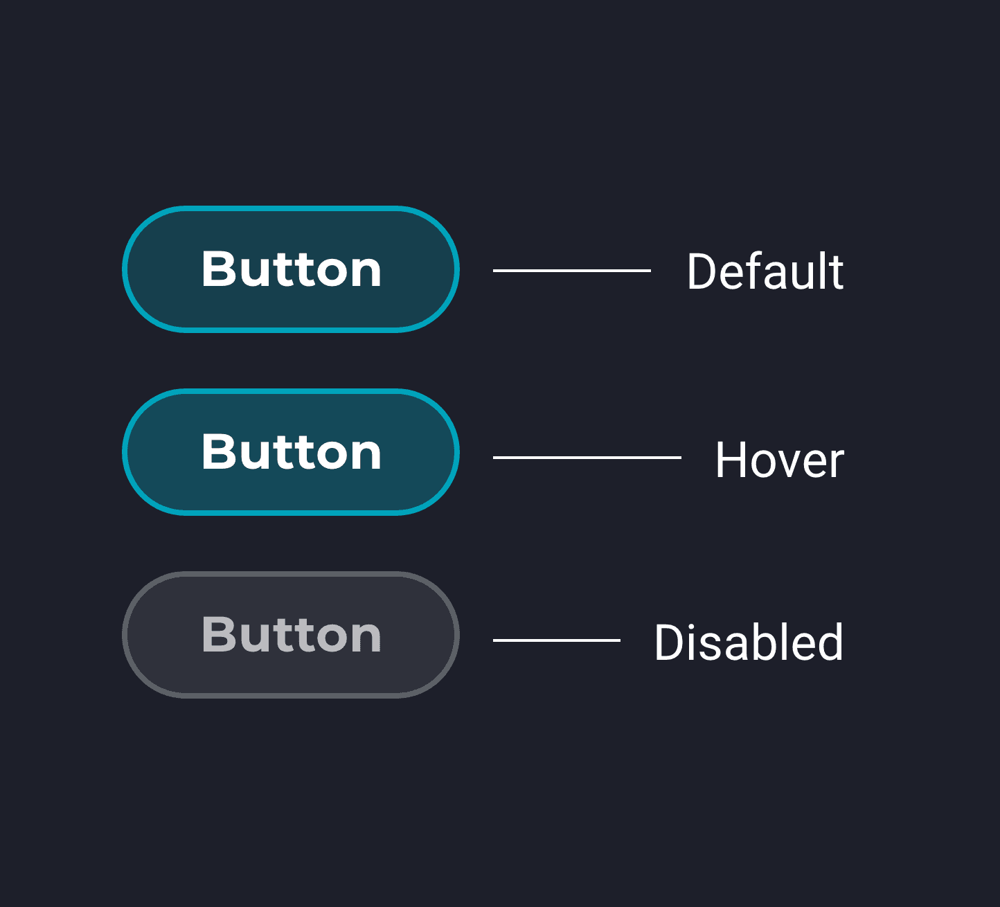
Button styles and states I created for the BoxCast design system.
Key Activities
Component Design
WCAG Compliance
Developer Collaboration
Writing Usage Guidelines
Implementation Coordination
Identifying Problems
How Problems Were Identified
I coordinated with other product team members including designers, developers, and product managers to better understand how components were being chosen and implemented across our collection of digital experiences.
Who Were the Users
Designers: Using the components and styles in prototypes.
Developers: Implementing the components and styles in production.
Support Staff: Responding to end-user requests using the components and styles.
End-users: Engaging across interfaces where the components and styles were used.
Designing Solutions
How Solutions Were Designed
The design system began with me exploring how standardized components, colors, and type styles could fit into BoxCast’s different interface environments. I consulted with the Marketing team to ensure the design system guidelines would align with their vision for the brand. As styles and components moved forward I partnered with a developer to begin translating from design to code.
Highlight
Creating Components and Patterns
Problem
Developers and designers both made new styles for components to fit whatever unique scenario they were working on.
Solution
I created reusable components and patterns in our design software while my development partner created a Github repository. We stored guidelines and links to these resources in a Confluence document accessible to the whole organization.
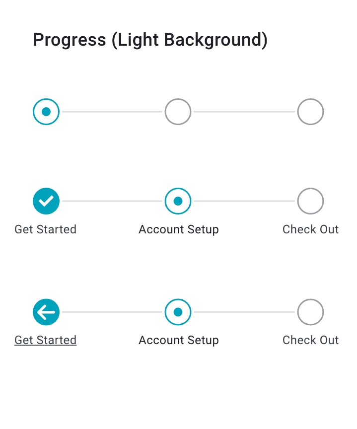
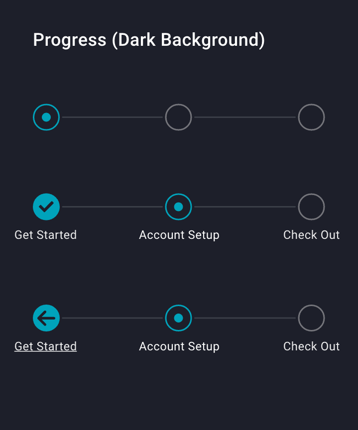

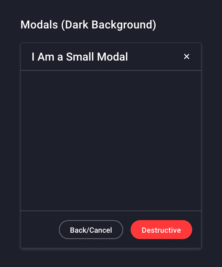

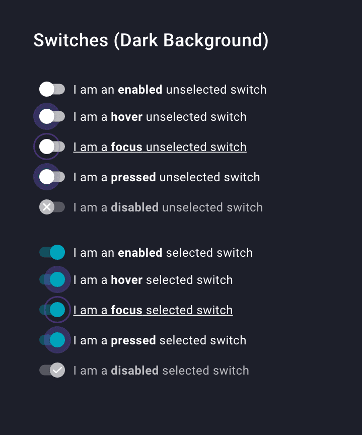
Component states for progress bars, modals, and switches shown in light and dark mode.
Highlight
Establishing a Style Guide

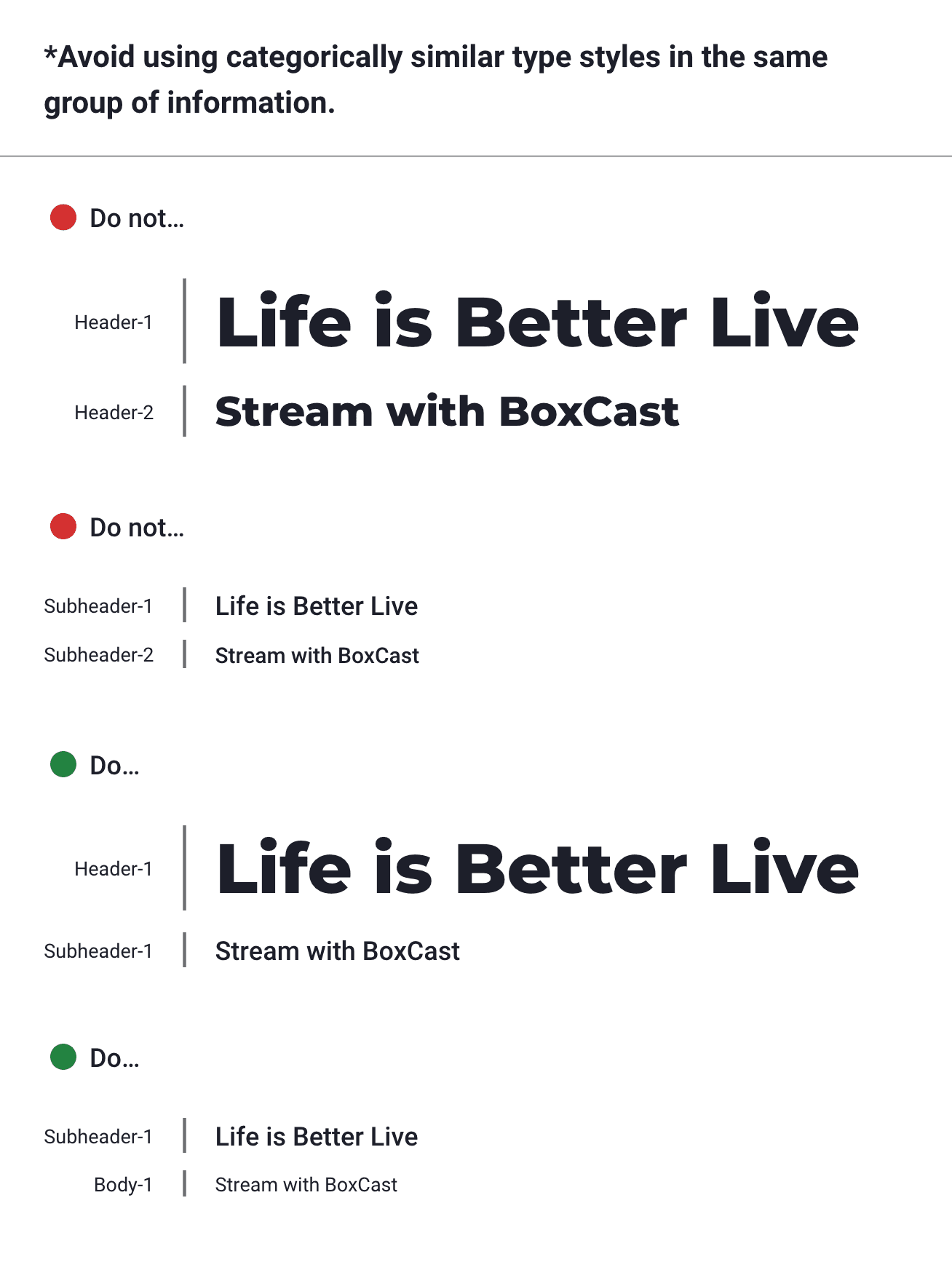
Figure 1) Standardized type sizes and default font weights I established for use across mobile and desktop products. Figure 2) Usage guide example for type style pairings I created.
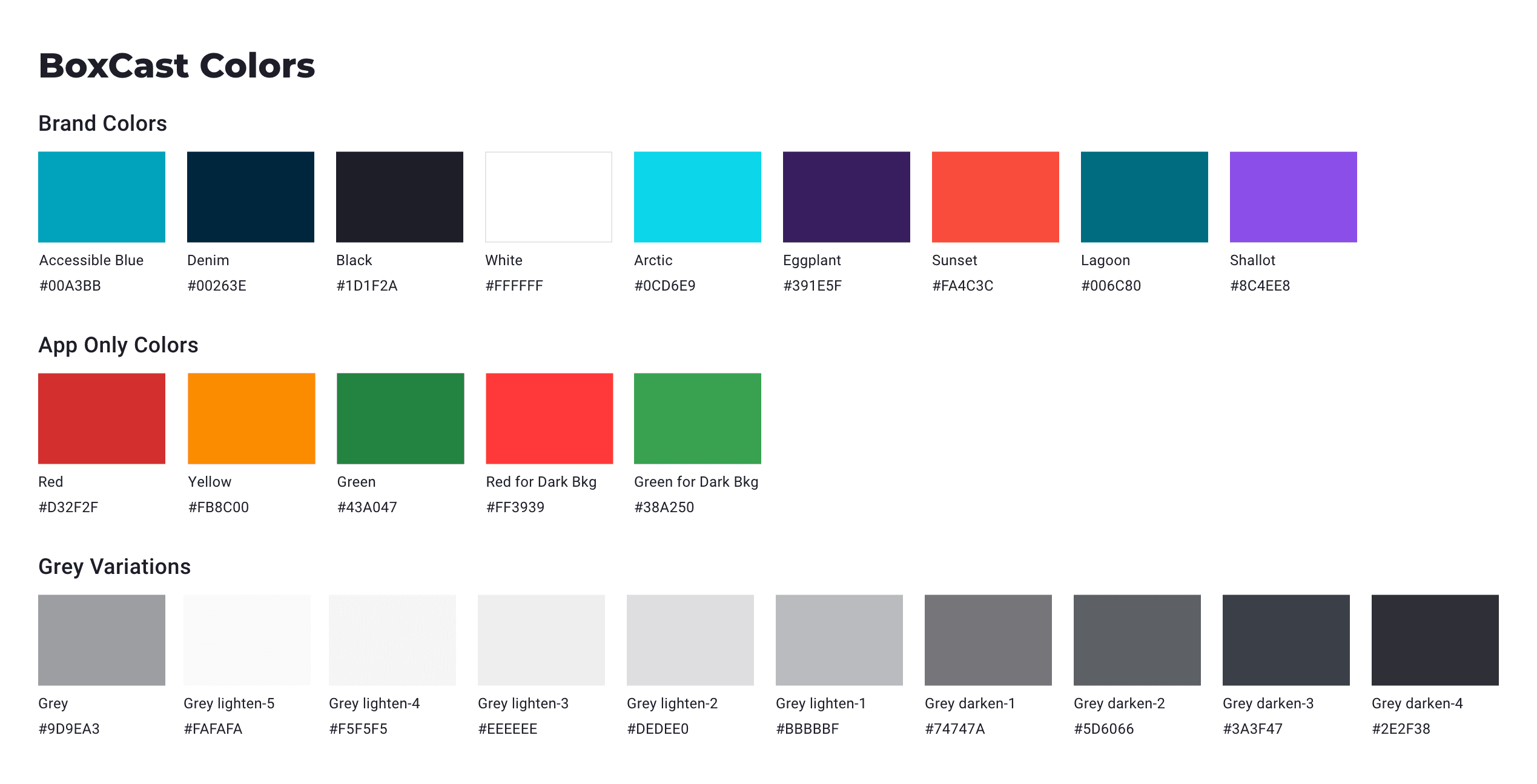
Colors for use across products including several light and dark mode variants I identified specifically for notification purposes.
Problem
Existing components would variably adhere to the company’s existing brand guidelines. On top of this, marketing was in the process of rolling out a new brand that did not have visual guidelines that accounted for web interfaces.
Solution
I created the style guide for the design system. This included documenting how and when to use each component as well as adding new colors, tints, and shades to the brand for communicating errors and other states.
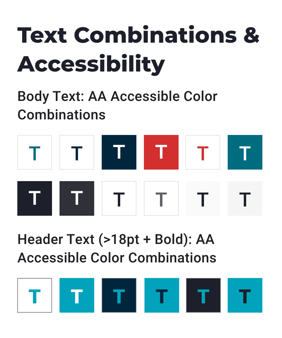
Examples of type and background brand color combinations that meet WCAG's AA standard for accessibility.
Highlight
Ensuring Accessibility
Problem
Many of the color combinations being used for text in the products did not meet WCAG AA Accessibility Guidelines.
Solution
I designed each new component to adhere with WCAG AA guidelines and clarified those guidelines in relation to our styles.
Upon Reflection
Project Status
Complete - the Design System went live and began to be incorporated across all interfaces.
As new functionality was introduced to the product, old code was updated and the marketing website was redesigned, the design system was able to enter use across all of BoxCast’s interfaces.
Personal Retro
The developer I partnered with on this project and I built out this design system as a side project while time allowed. The design system was encouraged, but not formally prioritized by the company. This made it difficult to fully implement because we were not able to acquire additional software or team support. However, I think it helped us to better communicate the benefits and ensure the usability of the design system because other designers and developers weren't forced to use it. Instead, we were able to show them the benefits and they picked it up willingly.

